Data visualisations on climate change
You can explore our climate change data and information with a range of data visualisations.
On this page:
Environmental health indicators dashboards
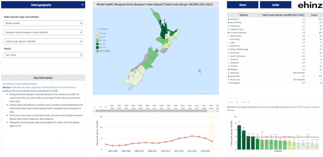
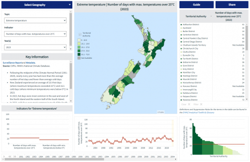
Dashboard of EHINZ climate change indicators by health districts and territorial authority
Dashboard of full EHINZ set of indicators by health districts and territorial authority, including air quality, water quality, UV, mosquito-borne disease, transport.

Extreme Climate Index
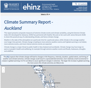
Extreme Climate Index summary reports for 1972-2022 by territorial authority - interactive online reports by territorial authority, showing ten Extreme Climate Index layers from 1972 to 2022.
The ECI has ten layers, shown annually by season. Each layer is a composite of several measures of extremes.
You can explore these ECI layers by territorial authority using our climate summary reports.
Social vulnerability indicators
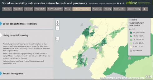
Social vulnerability indicators for 2018 by SA2, territorial authority, and health district.
Social vulnerability indicators are useful for understanding population vulnerability to climate-related hazards, and other natural hazards and emergencies such as pandemics. This Story Map lets you explore interactive maps of the Social Vulnerability Indicators for New Zealand for 2018.


